Suntory — White Label Design System
Bringing unity to 10+ global brands without losing their unique voice.
Overview
Suntory, the company behind brands like Laphroaig, Courvoisier, Sipsmith or Roku, wanted to unify the digital experience across their entire portfolio. Up until 2021, each brand had its own look and feel — which meant zero consistency and no shared foundations. Our challenge? Create a modular design system that respected each brand’s identity while reinforcing a strong Suntory backbone.

The Challenge
How do you build unity without flattening uniqueness?
Each brand had its own site, its own way of doing things — and while that supported individuality, it also created confusion, inconsistent user journeys, and internal chaos when it came to redesigns and maintenance. The business needed a system that could flex, scale and adapt — without feeling like a template.

The Solution
We built White Label, a modular system designed using atomic principles, where components could be mixed and matched across brands without compromising brand voice. Our aim was clarity and consistency — but also empowerment: letting brands work faster, stay coherent and still feel unique.
We iterated a lot. Early on, we made every mistake in the book — from building viewports manually to poorly structured components. But that mess was the spark: we reorganised, streamlined, and created documentation that brought real alignment between design and dev.


Key Moments & Frictions
Learning from chaos
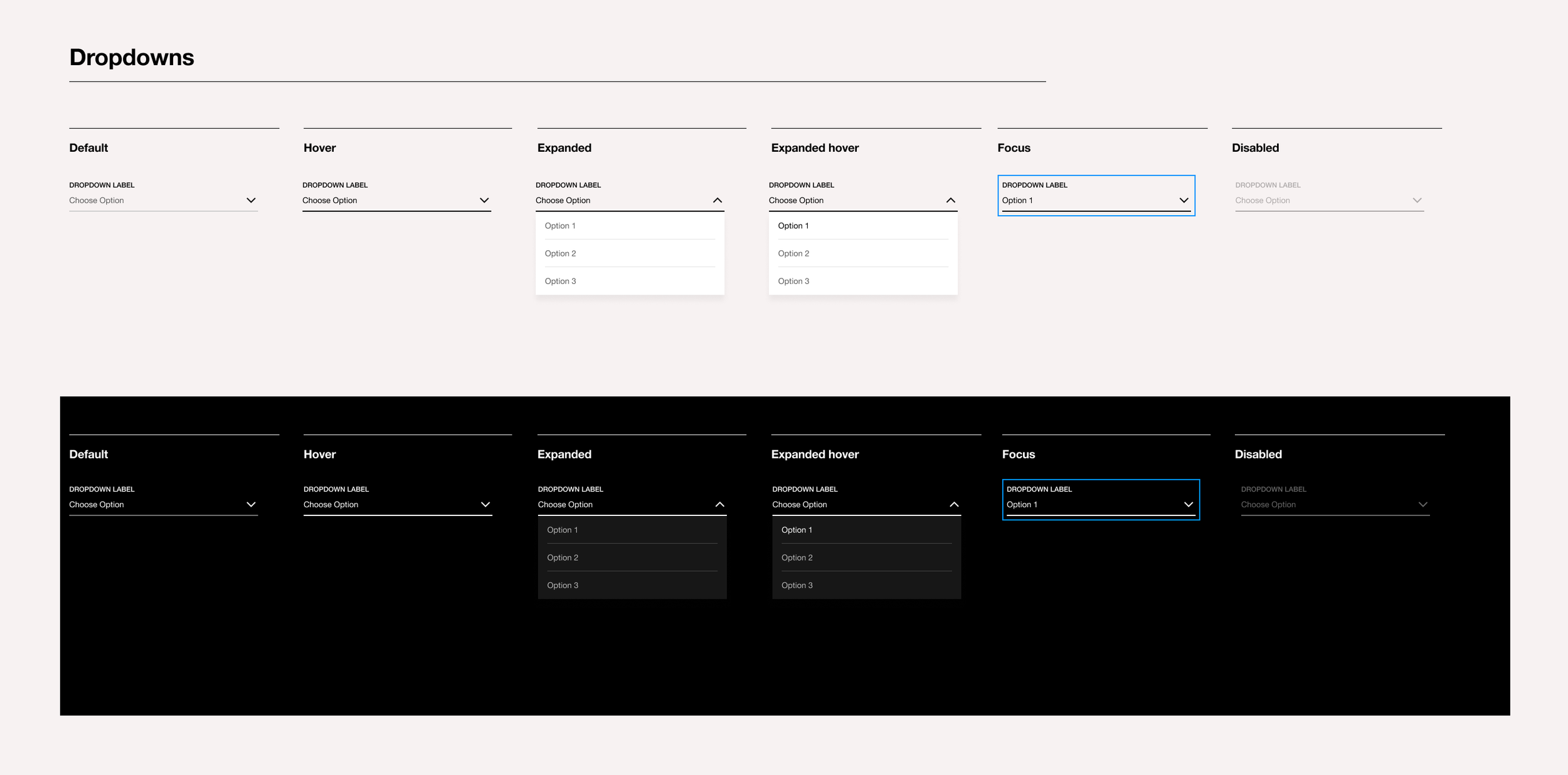
Our initial setup was manual, time-consuming and inconsistent. As we evolved, we embraced Figma’s Auto Layout and component structures, improving scalability and reducing design fatigue.
Defining a shared visual language
We unified icon sets, colour palettes and typography across brands. Each brand kept its essence, but followed consistent principles that improved usability and recognition.
Testing under pressure
Cruzan's website redesign was our first test. It revealed accessibility gaps and friction points, but thanks to the system's flexibility, we resolved them quickly and proved the model worked.
Scaling with tokens
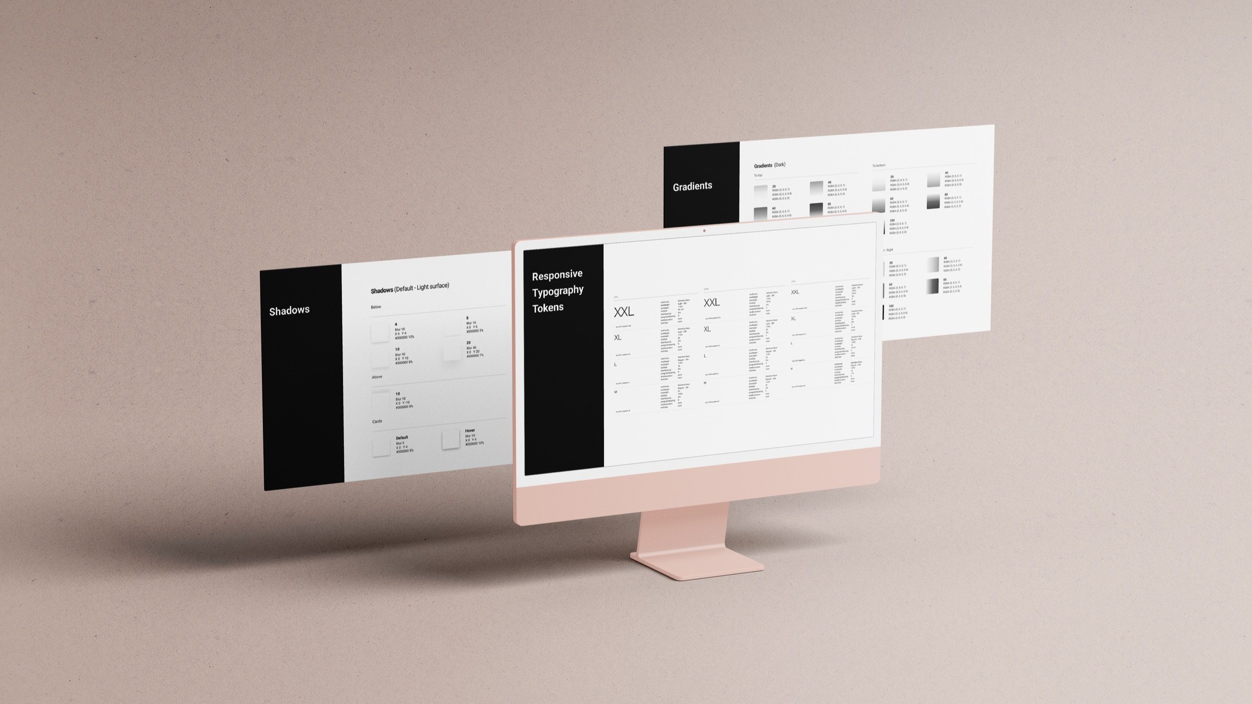
Introducing design tokens in 2022 allowed us to automate brand theming, cut delivery times and ensure consistency across 10+ brands. JSON files made dev handoff smoother and less error-prone.
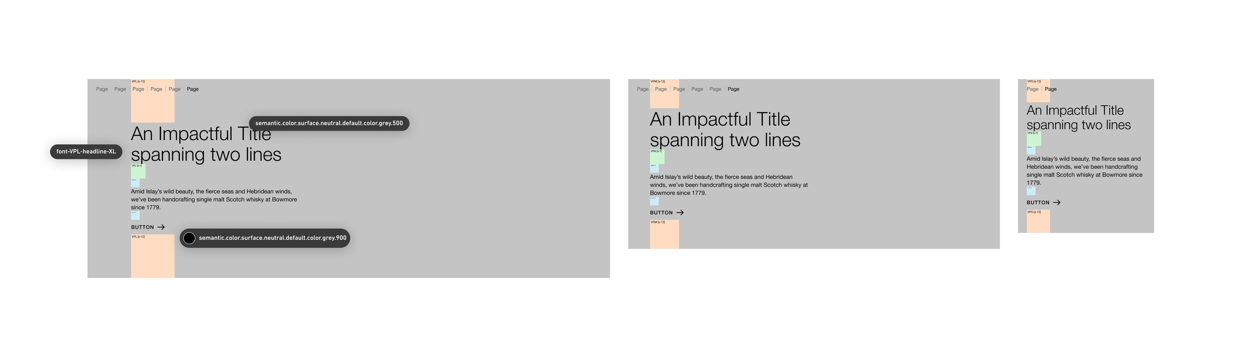
A Header of the White Label Design System showing its structure in different viewports

After having created a Design System, all brands are using the same layout with their own look & feel

Detail of flow of the token design system

Documentation & Dev Handoff
Everything lived in Confluence — from component usage to Figma libraries. It became our single source of truth and enabled both designers and developers to navigate the system independently.

Tangible Impact
🔹 One system rolled out across 10+ brands globally
⏱️ Reduced design-to-dev delivery times significantly
🌿 Enabled faster onboarding of new team members
🌼 120% increase in sales after Laphroaig’s relaunch
🌟 More time for UX strategy, less on pixel-pushing
What I learned
Sometimes the best systems are born from chaos. It’s not about getting it perfect from the start — it’s about listening, iterating, and co-creating something that works for both humans and brands. The key: structure, empathy, and a solid sense of humour.
Want to See More?
-
![A desktop computer on a grey concrete table, displaying the homepage of the project.]()
Blending | Cepsa
Leading a collaborative effort, I crafted an engaging user experience through thorough research and insightful interviews. The result? A cohesive platform that blends design with function beautifully.
-
![]()
Digital Accessibility Audit | Iberdrola
Comprehensive digital accessibility audit for three of Iberdrola’s internal platforms. Identified key usability issues and developed a roadmap for implementing a new, accessible, and user-friendly design system to enhance overall platform performance.
-
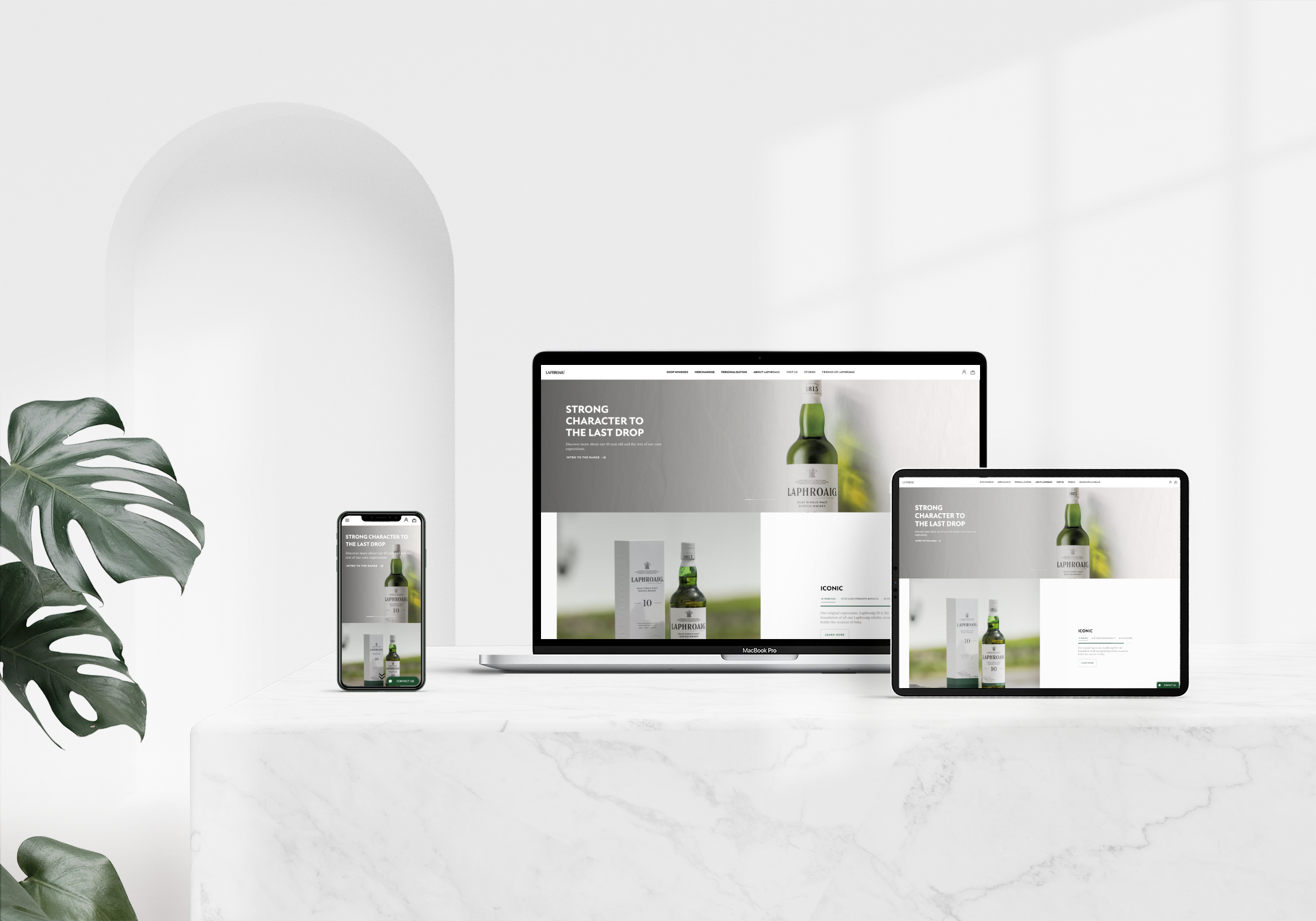
![The homepage displayed on three devices—desktop, tablet, and mobile—on a white marble table, with a monstera plant to the left.]()
Laphroaig | Beam Suntory
The redesign of Laphroaig’s website was a thrilling challenge, where I implemented a user-centred approach that significantly elevated brand presence and drove notable sales growth.
-
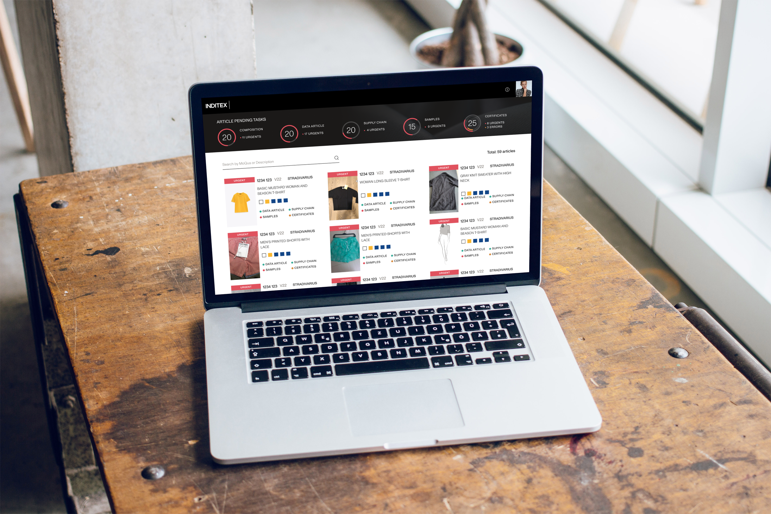
![A laptop on a workshop desk next to a window, displaying the homepage of the project.]()
Artemisa | Inditex
For Artemisa, I crafted an intuitive interface that resonates deeply with users, backed by thorough research and testing that led to a delightful journey enhancing overall brand interaction.
-
![The splash screen displayed on a mobile phone leaning against a white concrete wall with shadow play.]()
Gardenia
In this project, I aimed to create a visually stunning yet fully accessible design. Through collaboration and valuable feedback, we delivered an experience that captivates and engages diverse users.