Blending for Cepsa: From Excel Hell to Human-Centred Clarity
Redesigned their internal fuel mixing tool with and for the technicians — turning a cluttered interface into something intuitive, accessible, and ready for real-life use.
Client
Cepsa (now Moeve)
Year
2024
Timeline
8 weeks
My role
UX/UI Designer (solo)
Tools
Figma, Miro, MIMO Design System, Excel


Project Overview
Making complex blending feel simple
Blending is a digital tool used by fuel technicians to create better, more sustainable fuel mixes. When I joined the project, the tool was still based on Excel and felt more like a calculator than a product.
Our goal was to rebuild it with users in mind — intuitive, clear and grounded in real-life workflows.
The project was commissioned by Cepsa, now known as Moeve. I designed the new platform using their internal design system, MIMO, with close collaboration from their dev and product teams.
My Role
I worked hand in hand with the product manager and dev team — but led the entire design process solo. From early discovery to delivery, I mapped workflows, defined user needs, and built a fully functional and accessible interface.
Here’s what I did:
Led research with 4 fuel technicians
Translated Excel logic into a visual system
Designed the new interface using MIMO, Cepsa’s internal design system
Prioritised accessibility from day one
Collaborated closely with the dev team for smooth implementation
The Challenge?
Redesign a tool that was already working — but only for the few who had memorised its quirks.
The existing tool was functional but confusing. Built by and for engineers, it was packed with powerful logic — but completely lacked usability.
Our challenge was to redesign the interface without losing technical accuracy, and to make it feel faster, lighter, and a lot more human. I aimed to present digestible data in a cleaner layout so technicians could make better fuel mixes.

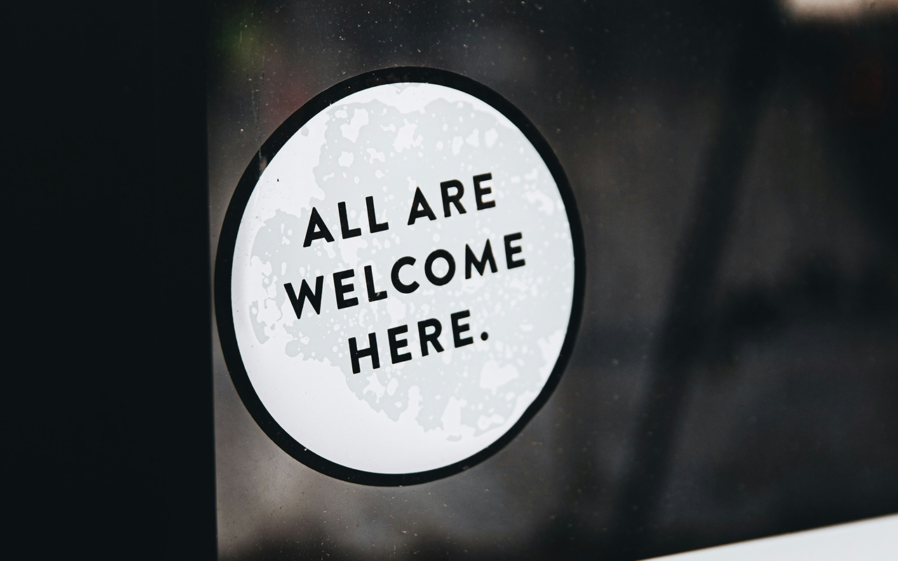
Picture by Jason Leung
User Interviews
Spoke to 4 fuel technicians in real environments
Logic Translation
Turned Excel formulas into visual, editable flows
Designed with MIMO
Used Cepsa’s design system to build a consistent, accessible UI
Accessibility from the start
Considered real usage conditions, not ideal ones
Plain language everywhere
Adjusted copy to reflect technician vocabulary
Weekly iterations
Tested and improved the UI throughout the process
What I did
I led the design process solo, but never worked in isolation. From the start, I collaborated with the technicians who use the tool every day to make sure the new platform reflected real needs — not just nice-to-haves.
My process was practical, lean and deeply iterative.
Real-world impact
“Now it actually helps us — before it was just something we had to fight with.”
— Technician, during final testing
The new platform became more than a redesign — it was a shift in mindset. Built with the people who use it, not just for them.
What Made It Work
The tool worked because we never assumed — we asked. Every design decision was grounded in the day-to-day realities of the technicians using it.
They weren’t “users”. They were collaborators.
We simplified without removing power. We clarified without dumbing down.
The copy matched their language. The flows respected how they actually work. And the visual structure was clear enough to reduce cognitive load in high-pressure moments.
“They stopped calling it ‘the spreadsheet’ — and started calling it the tool.”

The new platform was implemented directly after handoff, with no additional iterations — because the technicians had already shaped it through testing.
It replaced a system that was functional but fragile, with one that was intuitive, accessible, and scalable. Today, it’s used daily by the full technical team, and has become a trusted part of their workflow
“It’s the first time I’ve felt the tool was designed for how I work — not against it.”
From copy-paste mayhem to clarity in just a few clicks — here’s how the new Blending Tool works IRL.

The Result

Collaboration is a design tool
Working directly with technicians gave the project meaning and precision — they weren’t just participants, they were co-creators.
Design systems need to stay flexible
Using MIMO helped with consistency, but we had to adapt its components to real-life data and flows.
Sometimes “simple” is the hardest thing to build
Turning an Excel monster into something intuitive meant letting go of assumptions and designing with clarity above all.
Accessibility doesn’t mean compromise
We proved that inclusive design can be beautiful, scalable and easier for everyone — even in industrial contexts.
Key Learnings
Wrapping it up

This project reminded me that designing well isn’t about making things look good — it’s about making them work, for real people, in real contexts.
I didn’t just redesign a tool. I helped a team do their job more confidently, clearly and independently.
And to me, that’s what good design feels like.
At the end of the day, I didn’t just deliver screens. I helped turn a fragile tool into something people could trust — and that’s the kind of work I want to keep doing.
Want to See More?
-
![]()
Digital Accessibility Audit | Iberdrola
Comprehensive digital accessibility audit for three of Iberdrola’s internal platforms. Identified key usability issues and developed a roadmap for implementing a new, accessible, and user-friendly design system to enhance overall platform performance.
-
![A pink desktop computer with two floating screens on either side, displaying design system details: typography, shadows, and gradients.]()
White Label Design System | Beam Suntory
Working with an exceptional team, I developed a modular design system that empowers brands to maintain their unique identities while ensuring a consistent user experience for all.
-
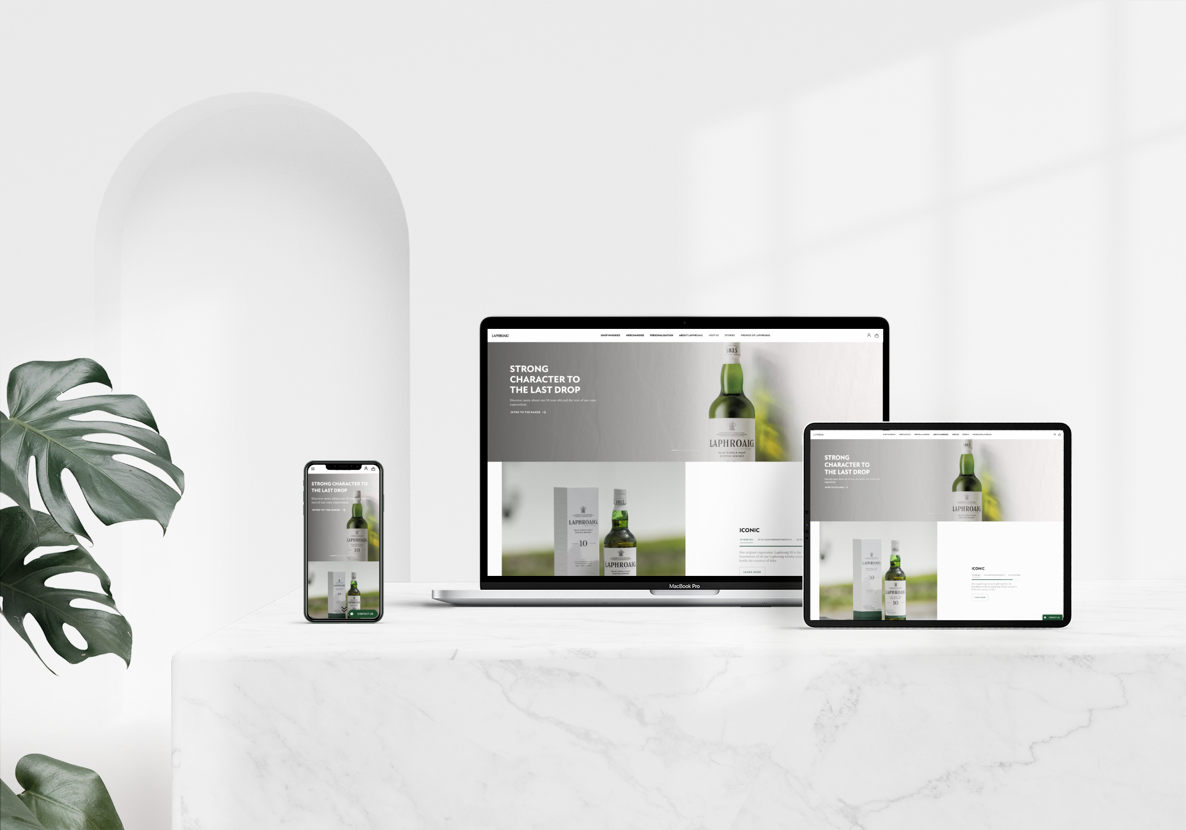
![The homepage displayed on three devices—desktop, tablet, and mobile—on a white marble table, with a monstera plant to the left.]()
Laphroaig | Beam Suntory
The redesign of Laphroaig’s website was a thrilling challenge, where I implemented a user-centred approach that significantly elevated brand presence and drove notable sales growth.
-
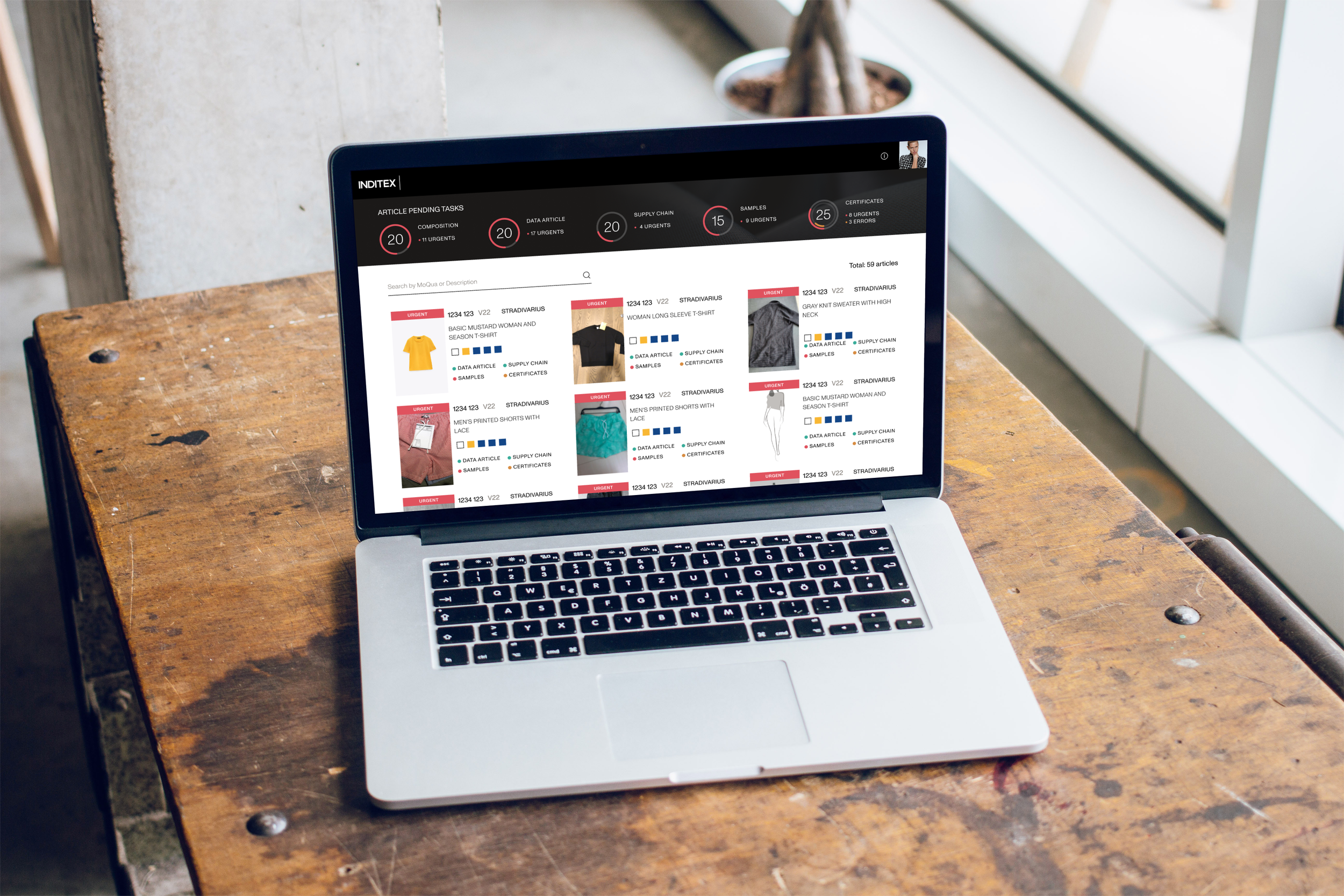
![A laptop on a workshop desk next to a window, displaying the homepage of the project.]()
Artemisa | Inditex
For Artemisa, I crafted an intuitive interface that resonates deeply with users, backed by thorough research and testing that led to a delightful journey enhancing overall brand interaction.
-
![The splash screen displayed on a mobile phone leaning against a white concrete wall with shadow play.]()
Gardenia
In this project, I aimed to create a visually stunning yet fully accessible design. Through collaboration and valuable feedback, we delivered an experience that captivates and engages diverse users.