Laphroaig - Website Redesign for Suntory
From chaos to coherence: redesigning a luxury whisky brand with accessibility and systems at heart.
Overview
Laphroaig is a legendary Scottish whisky brand known for its rich heritage and bold, peaty flavour. As part of the Suntory portfolio, it draws thousands of visitors each month. But its website wasn’t doing it justice: outdated, cluttered and confusing, it failed to reflect the brand’s identity — and even more importantly, it turned users away.
Our goal was clear: redesign the entire digital experience, making it accessible, visually compelling and rooted in the Laphroaig identity. And we had to do it fast.
The Challenge
This was our first full-scale eCommerce project, and it came with a countdown. The new site had to be live before peak sales season. Midway through the project, our team structure evolved — new people joined, priorities shifted, and we had to stay flexible and aligned under pressure. We were designing under pressure, adapting quickly, and maintaining quality under chaos.
My Role
As design lead, I was responsible for aligning our internal team and keeping stakeholders in the loop. I led design reviews, facilitated decisions, and worked closely with devs, content and SEO to ensure consistency. I also made sure accessibility wasn’t just a checklist item but a guiding principle from the start.
Approach & Process
Turning the brand book into real foundations
We translated the brand book into design foundations: colour palette, typography, spacing, patterns. Once the essentials were applied, we ran an initial accessibility check to make sure we were building inclusively from day one.
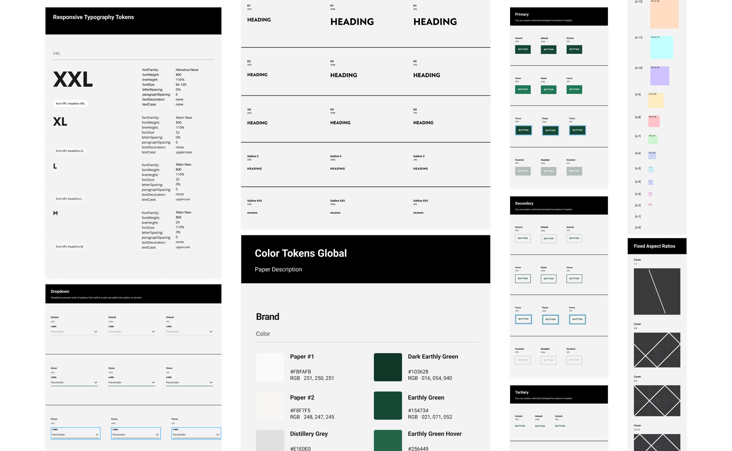
Systematising with tokens
Once the base was stable, we transitioned everything into the White Label design system, powered by tokens. This allowed us to scale faster and adapt brand-specific variations without rebuilding from scratch. There were some hiccups, but we learned quickly and made the system stronger.
Building modules (and learning by doing)
At first, we made classic mistakes: copying modules manually, struggling with alignment. But when we embraced Auto Layout and smarter component logic, everything changed. The workflow got smoother, the results cleaner, and our sanity returned.
Final stretch: QA, SEO, and polish
With design foundations in place, the content and SEO teams optimised all copy and visuals. We ran thorough QA and UAT sessions, tested the site across viewports, and prepped it for <


Final Steps Before the Hand-Over
With the Design Foundations and the brand’s aesthetic successfully applied, the Content and SEO teams began the crucial task of optimising and approving the brand’s content, preparing it for upload to the website.
The journey from our initial meeting with the client to the exciting launch of the website spanned six months. During this time, my team and I conducted thorough QA and UAT to ensure the website delivered optimal performance and an exceptional user experience.


Here you can see some other examples that followed the same process


Want to See More?
-
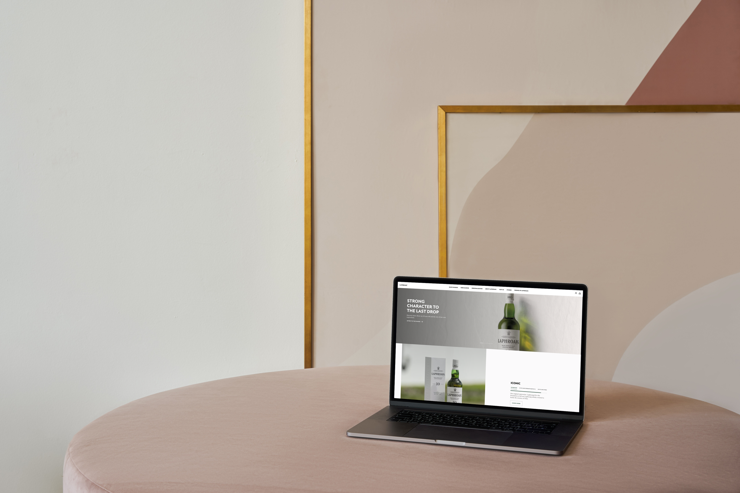
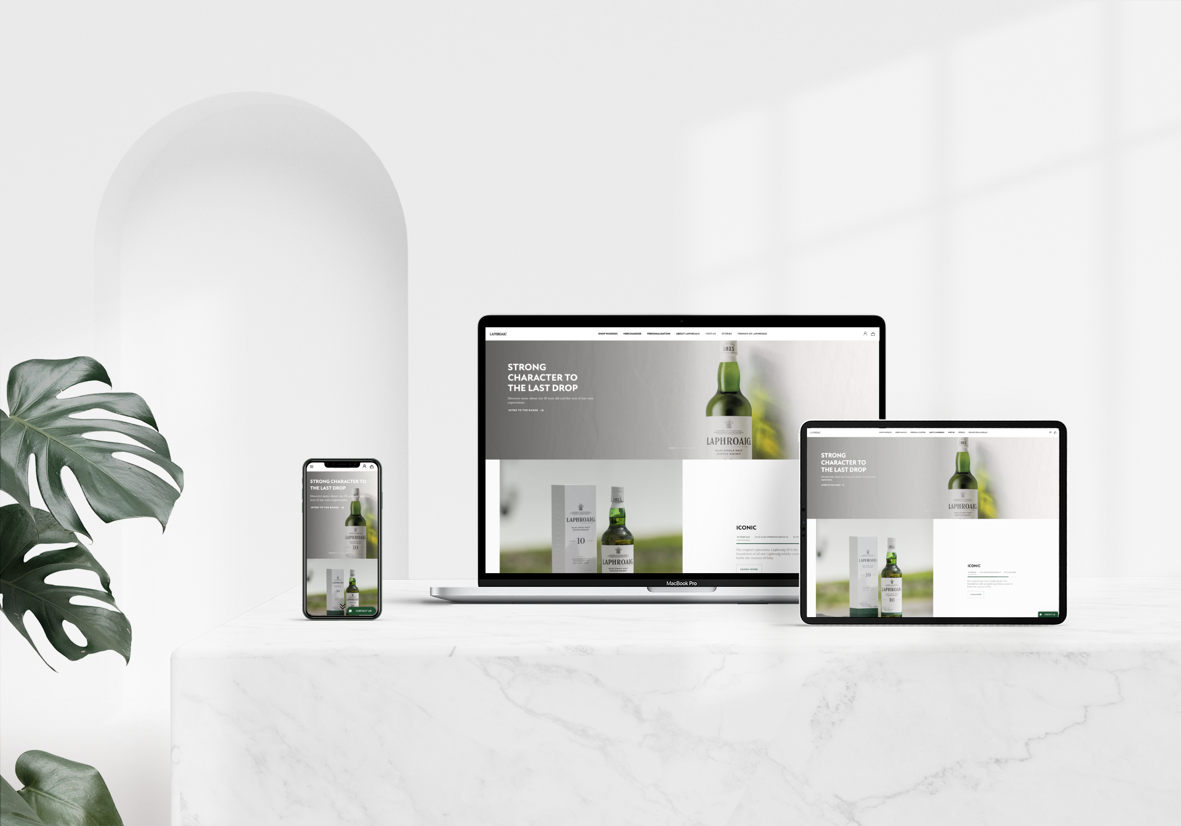
![A desktop computer on a grey concrete table, displaying the homepage of the project.]()
Blending | Cepsa
Leading a collaborative effort, I crafted an engaging user experience through thorough research and insightful interviews. The result? A cohesive platform that blends design with function beautifully.
-
![]()
Digital Accessibility Audit | Iberdrola
Comprehensive digital accessibility audit for three of Iberdrola’s internal platforms. Identified key usability issues and developed a roadmap for implementing a new, accessible, and user-friendly design system to enhance overall platform performance.
-
![A pink desktop computer with two floating screens on either side, displaying design system details: typography, shadows, and gradients.]()
Design System - White Label
Working with an exceptional team, I developed a modular design system that empowers brands to maintain their unique identities while ensuring a consistent user experience for all.
-
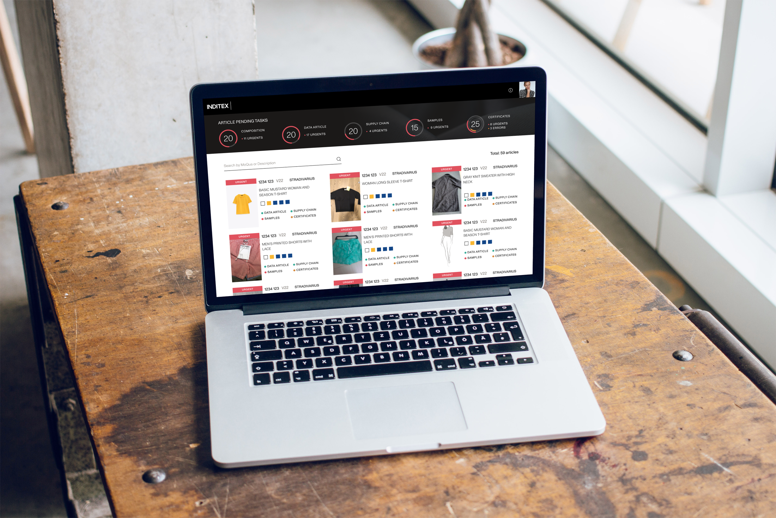
![A laptop on a workshop desk next to a window, displaying the homepage of the project.]()
Artemisa | Inditex
For Artemisa, I crafted an intuitive interface that resonates deeply with users, backed by thorough research and testing that led to a delightful journey enhancing overall brand interaction.
-
![The splash screen displayed on a mobile phone leaning against a white concrete wall with shadow play.]()
Gardenia
In this project, I aimed to create a visually stunning yet fully accessible design. Through collaboration and valuable feedback, we delivered an experience that captivates and engages diverse users.